Friday, 23 September 2022

update of front cover 1


 - changed my font for cover lines, before it looked childish and unprofessional. moved to a more professional font similar to other aspirational lifestyle magazines to fit the brief. 

- changed 'Louise cousins' from white to red to stand out as she is presented as the cover star so will be the main attraction of the magazine

Further Developments on Front Cover 2


Further Developments
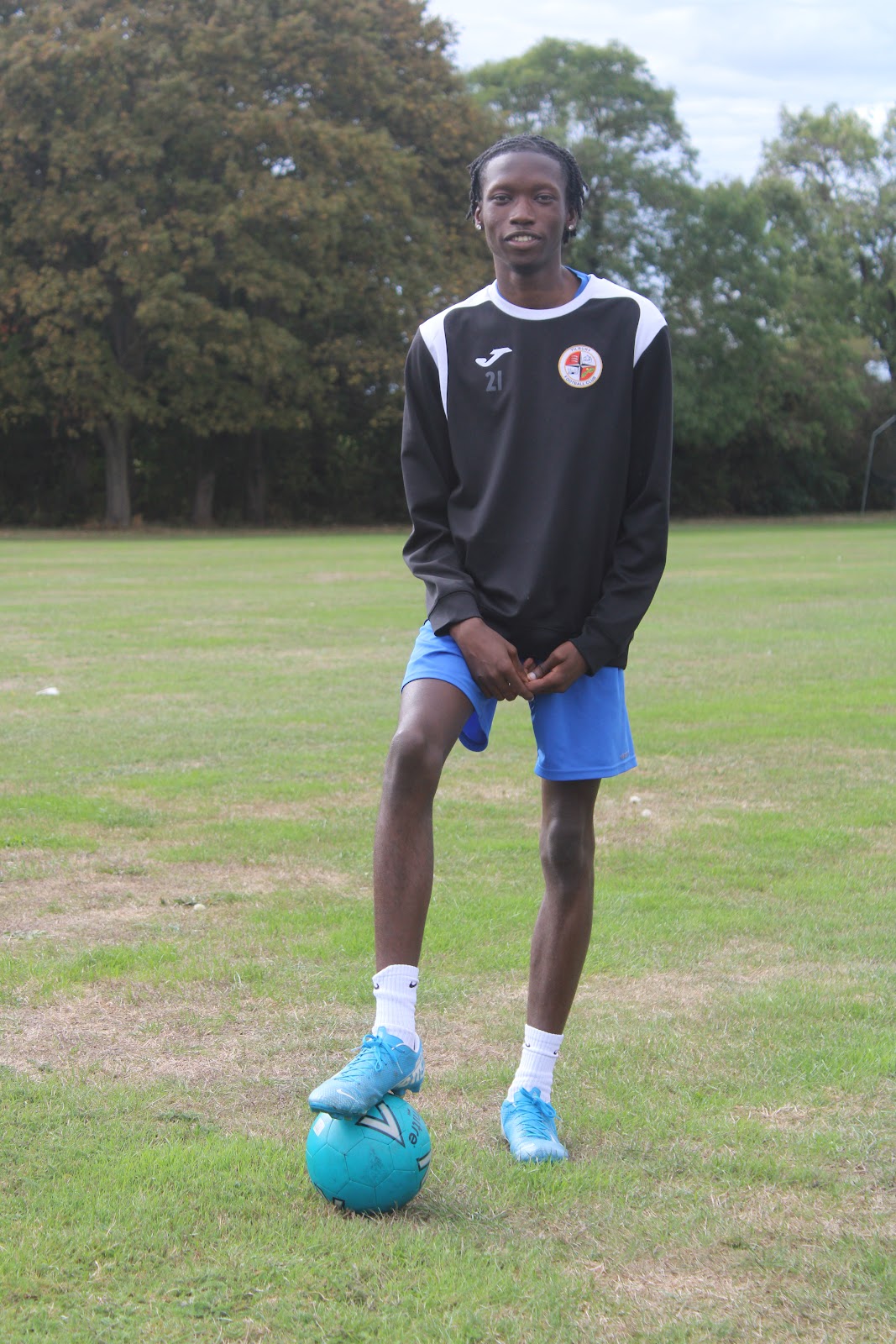
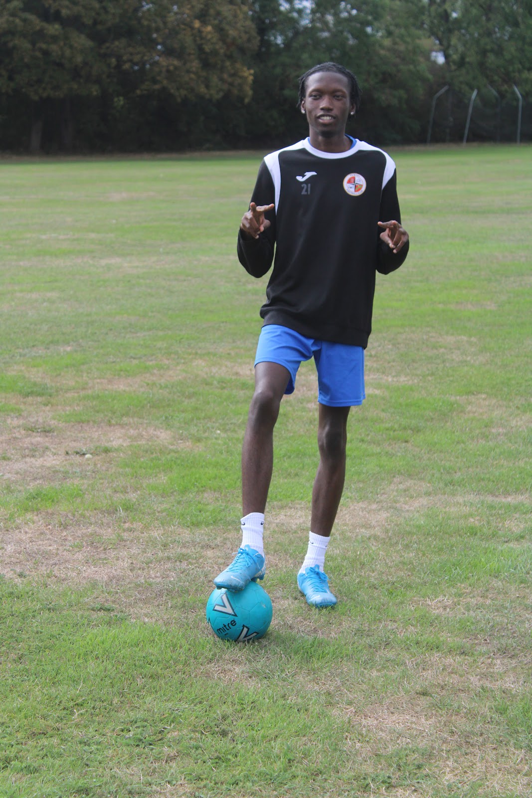
- I have updated the colours on front cover 2. The use of neon green was too much and came across as childish and unprofessional. I have instead decided to opt for the same tone of blue as worn on my model Pemi. This is because it matches alot better and is easier on the eye.
-Furthermore the body and article headings are in black or blue to stand out against the plain grass
-I still need to find a more professional looking font.


Thursday, 22 September 2022

Further Development of front cover 2


Further Developments
-I have now implemented plugs for my articles
-I need to remove the page numbers from articles as it appears unprofessional and unaesthetic
-I need to find a new font for headlines and body of my cover as the font i have now appears childish and takes away from the aesthetics of the magazine
 

Further developments Front Cover 2


Further Developments

-I now know where to place my articles.

-I need to now develop a colour scheme that is aesthetically pleasing  


Initial draft front cover 2


Initial draft
This is my initial draft for my front cover 2. It provides me a rough idea as where to frame my model, I have chosen centre with a direct mode of address as to follow the brief.
- I have placed my title in the top left with the same font as my other front cover as to retain the brand identity and play into the digital convergence.
- I now need to identity if i want to keep my color scheme and where to place my articles


First draft Contents page 1


Initial Draft
-I have set out my columns for where my articles will fit in. I plan to utilize the photo of Louise facing away as my background. I believe that by placing my articles on the left side they act as a filler to the blank space.
-Furthermore i have created digital convergence through the continued brand identity, this is done via the same font whenever the brand name is seen. This creates a sense on continuity and the font itself carries the brand identity and the credibility it possesses. the font acts as a symbol of status, every product that has this font is recognized as a product of Evolve.
-I need to further develop my editors letter by adding a photo of my editors as well as developing the content presented


Further developments on Front Cover 1


Further developments
-I have now added digital convergence via the 'evolve.co.uk'. This provides a way for the audience to access my work, with the decline in print greater advertisement of online media is constant throughout the contextual industry.
-I now have an idea where my articles will be placed, although must remove my page numbers as it is not aesthetically pleasing
-I need to find a more aesthetically pleasing font
 

Friday, 16 September 2022

First draft of front cover 1


-This is my first draft, with a rough idea of what will be placed where. With the title on the top left hand side. My model, Louise, is pictured straight on which follows many of the conventions of typical magazines, framed straight on with direct mode of address
-Over time I will find out where to place my articles and focus on finding more aesthetically pleasing font.

Photoshoot (3)


Statement of Intent